Material Design 3: Elevating the Aesthetics of Android Apps


In the ever-evolving world of Android app development, aesthetics play a pivotal role in shaping user experiences. The visual appeal of an app, its design, and overall look and feel can be the deciding factor between users falling in love with it or swiftly uninstalling it. In this context, Material Design, a design language introduced by Google in 2014, has consistently served as the guiding star for creating visually appealing, user-friendly Android apps.
However, as with any design philosophy, Material Design has evolved over time. The recent release of Material Design 3 brings with it not only a new design language but also updates to Material Design components. It’s the perfect time to delve deep into this design philosophy, understand its core principles, and gather valuable tips for crafting beautiful Android apps that users will adore.
Understanding Material Design
Material Design is more than just a set of guidelines; it’s a design philosophy grounded in three foundational principles:
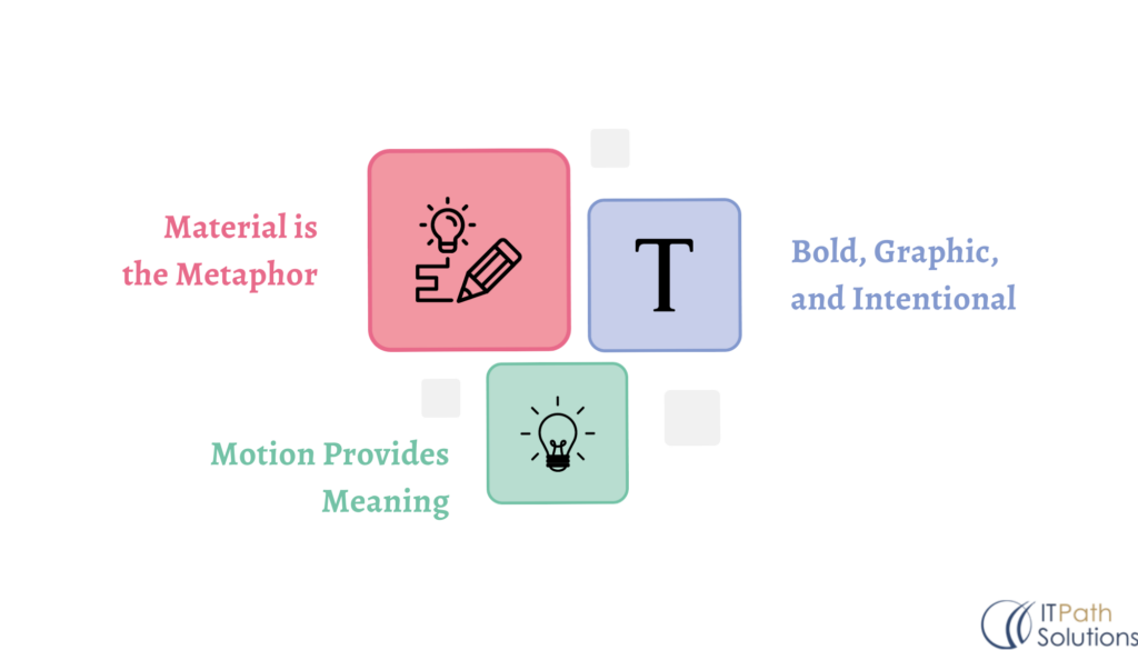
Fig-2 Foundational principles
Material is the Metaphor
Material Design is deeply rooted in the metaphor of paper and ink. In this design philosophy, elements on the screen are akin to sheets of paper, and user interactions are like ink on paper. This metaphor brings a tactile and intuitive quality to the design, making users feel like they are interacting with physical objects. It’s about creating an experience that is both digital and tangible.
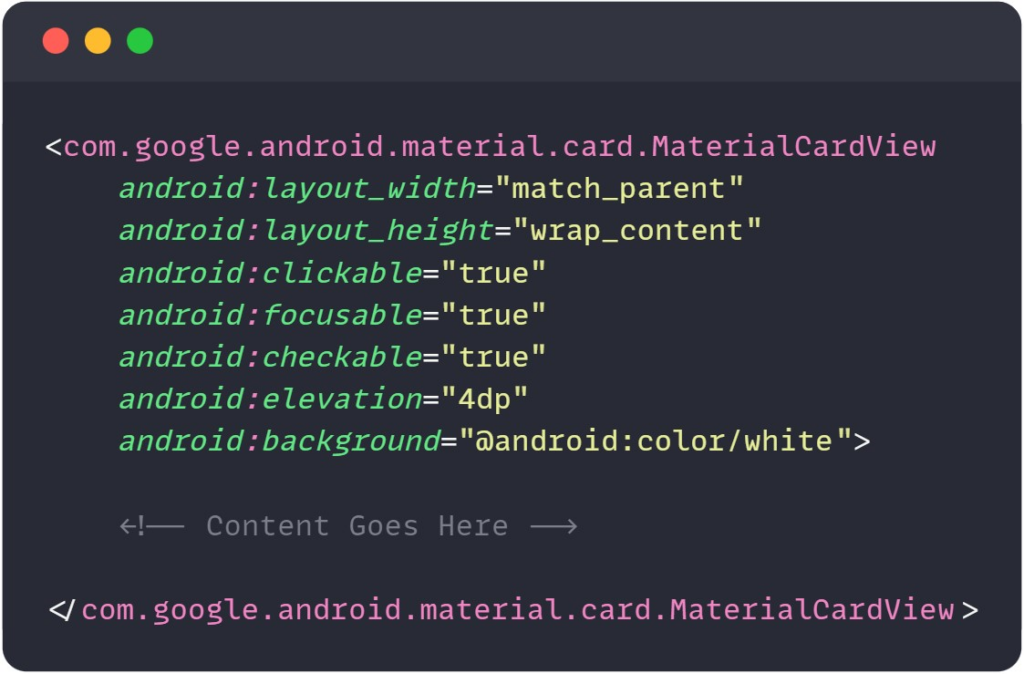
Fig-3 Use of Elevation for Material Shadow
Explanation: Elevating a view creates a shadow, mimicking the idea of layers of material. This adds a tactile feel to the design, making it visually appealing and intuitive.
Bold, Graphic, and Intentional
Material Design encourages bold use of color, typography, and imagery. The emphasis here is on clear, deliberate design choices that guide users through the app and create a hierarchy of information. Bold and intentional design elements not only look attractive but also help communicate the app’s purpose and enhance user engagement.
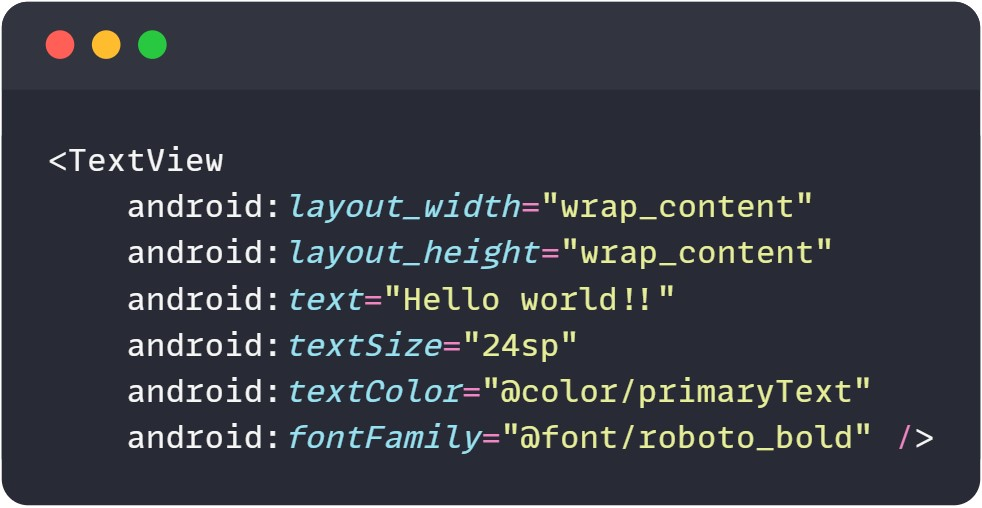
Fig-4 Bold Typography and Clear Design Choices
Explanation: Emphasizing bold typography and clear design choices helps guide users through the app and establishes a hierarchy of information, making the interface more intentional and user-friendly.
Motion Provides Meaning
Motion is a significant component of Material Design. It’s not merely about eye-catching animations; it’s about using motion to guide user attention, provide feedback, and create a sense of continuity and connectedness within the app. Well-executed motion design enhances the user experience and adds that extra layer of engagement.
Consider implementing shared element transitions or other motion effects using the ‘MotionLayout’ or ‘Transition’ classes in Android.
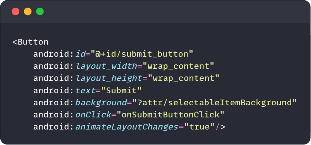
Fig-5 Motion for User Feedback
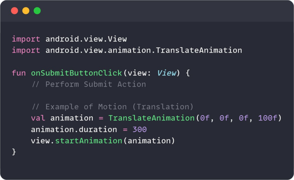
Fig-6 Motion in Kotlin Code
Explanation: Incorporating motion not only makes the app visually engaging but also serves a functional purpose, such as providing feedback on user actions. In this example, the button animates when clicked, giving the user a sense of interaction and continuity.
Tips for Material Design in Android Apps
With a solid grasp of the core principles of Material Design, let’s now dive into practical tips for implementing Material Design in your Android apps. These tips are especially pertinent with the recent release of Material Design 3:
Consistency is Key
Consistency is the bedrock of Material Design. It’s crucial that your app’s design elements maintain a coherent look and feel. This includes consistent spacing, typography, and color schemes throughout the app. When users encounter familiarity in your app’s design, they find it easier to navigate and interact with your app as they intuitively understand the visual language.
Leverage Dynamic Theming
A significant enhancement with Material Design 3 is the concept of dynamic theming. Dynamic theming allows users to personalize the look and feel of your app. You can offer options for light and dark themes, and perhaps even allow users to select primary and accent colors. This personalization not only enhances the user experience but also makes your app feel like it’s tailored to individual preferences, creating a more engaged user base.
Read More:
https://www.itpathsolutions.com/material-design-3-elevating-the-aesthetics-of-android-apps/